While there are plenty of wall color schemes that are well-suited for office interiors, there are a handful that can actually detract from a room’s energy or distract from daily tasks.
If walls could talk, you and your employees would certainly prefer an encouraging or inspiring officemate rather than someone abrasive, obnoxious, or negative. So how do you know whether your current color story is an asset to your team or a weak link? If you’re starting fresh in a new space and want to select the perfect paint, or if you’ve been approved for a renovation, how can you choose wisely?
We’ve got the lowdown on your favorite colors’ psychological and decorative benefits, and we’re here to help when you’ve found the right fit for your commercial or home office.
Here’s how to know when to paint over an ineffective color, and what to look for instead for a surefire upgrade. Even if you’re starting from scratch, we’re giving you a head start.

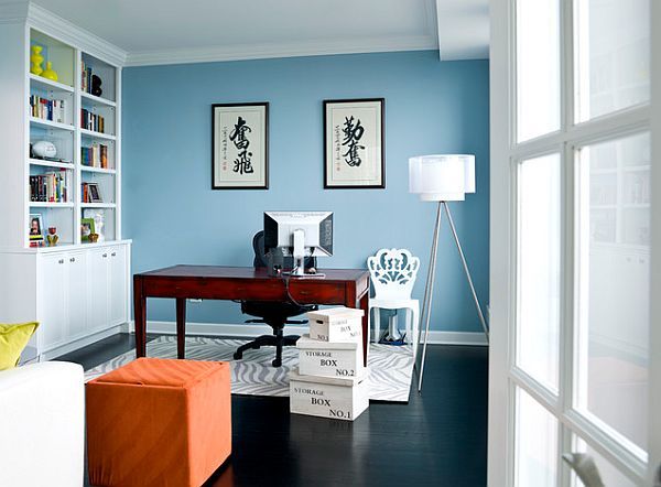
Paint over white or grey with a pale blue
White is one of the most common office wall colors. Whether your commercial space came with white walls that have yet to be repainted or management hand-selected it for a crisp, simple, and straightforward finish, it isn’t as ideal as you might assume. Similarly, though many offices side with grey as a neutral option, it may be time to think twice.
White lacks any productivity benefits, while grey tends to suppress emotion and motivation. It can even promote a lack of confidence. But is there a worthy substitute for those who prefer a soft wall color that eases into the background? A light, desaturated, barely-there blue tone is not only subtle — it also offers calming benefits, promotes focus, and is known to stimulate productivity.

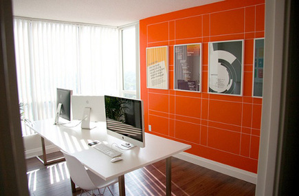
aint over red with a tasteful orange hue
While red is known to energize, stimulate, and excite, it is often subconsciously perceived as a signal of danger. Though it is sure to attract attention and spark high intensity, this can also serve as a distraction or stressor.
Orange carries similar stimulating benefits without the negative association with hazard. It has been heralded as the best color for concentration and productivity according to Feng Shui principles and modern interior design preferences. If you want to create a bright and bold space, try an orange statement wall if you’re not quite ready to commit to all-over color (just be careful not to clash with other conflicting paint hues).

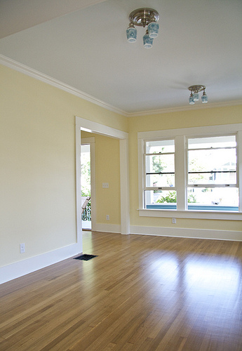
Paint over bright yellow with gold or pastel
Here’s a quick a word association game:
What is the first color that comes to mind when you hear the word “energize”?
If you thought of yellow, you’re not alone. After all, yellow is the color of the sun, so this association is only natural. And what better way to boost office morale than to energize your employees through the use of color?
Well, while it may be energizing, too much yellow (especially primary hues) can actually aggravate anxiety. Nerves can run high when overexposed to bright yellow, and energy plus anxiety may even be a recipe for recklessness.
If you don’t want to nix yellow altogether, opt for either a deep and rich or light and subtle hue. Gold tones can add warmth and character, while pastels can be cheerful yet delicate.

Paint over too-dark tones with any office-ready color scheme!
Super-intense dark colors have their place, but depending on your industry, you likely don’t want your business giving off a Halloween horror house vibe. In an office setting, dark charcoal, ultra-deep eggplant, and similar tones can put a damper on the decor and bring down the overall mood. A statement wall here or there may add character, but as an all-over color scheme, darker tones can make the space feel smaller, more claustrophobic, or dreary.
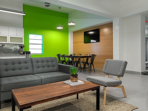
To inspire your team and help clients enjoy the atmosphere with a color scheme other than those already mentioned, consider going tastefully bold with a vibrant teal or green, subtle and sweet with a trendy pale rose, or cool and calm with mint or cream.
